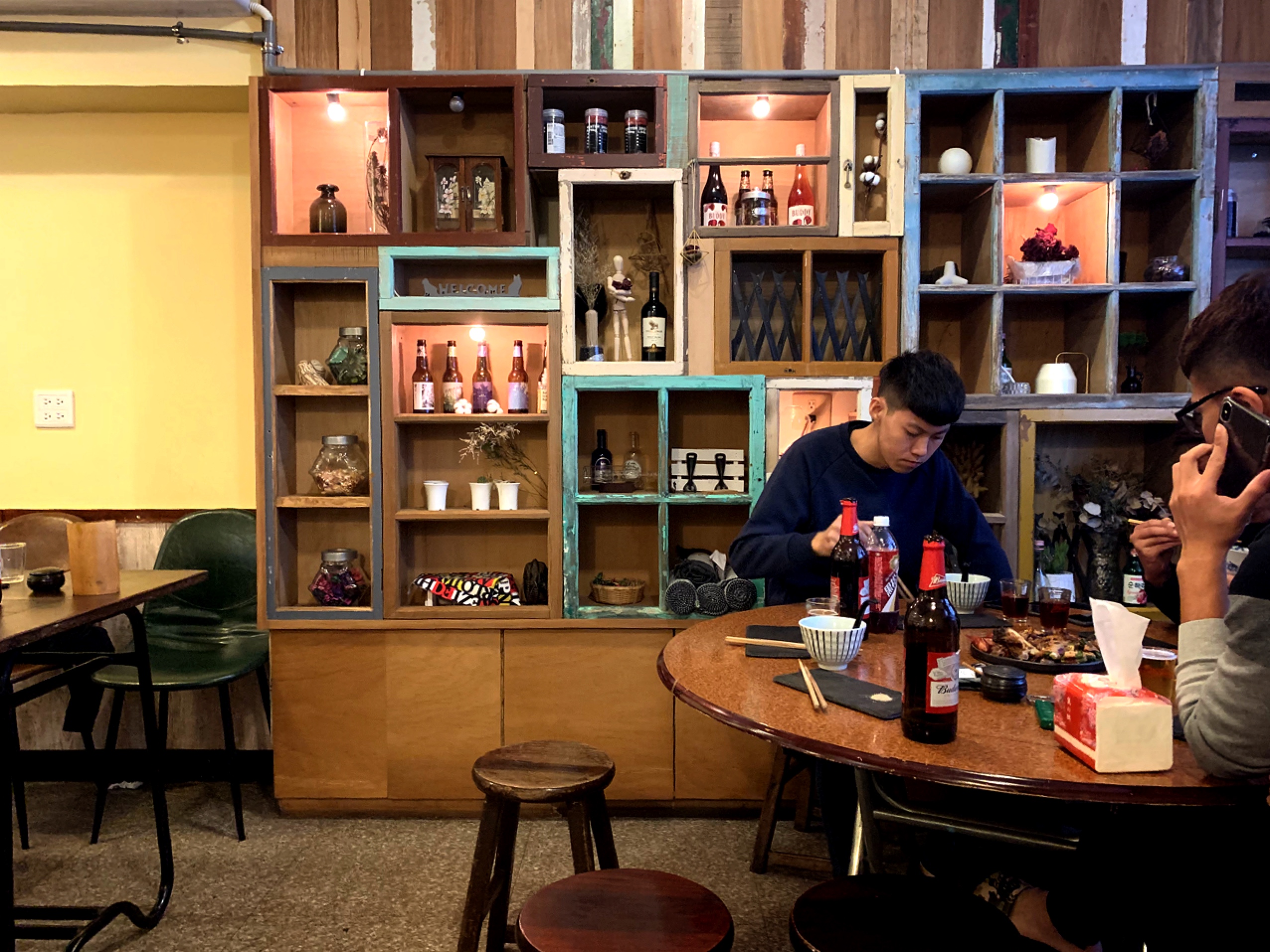
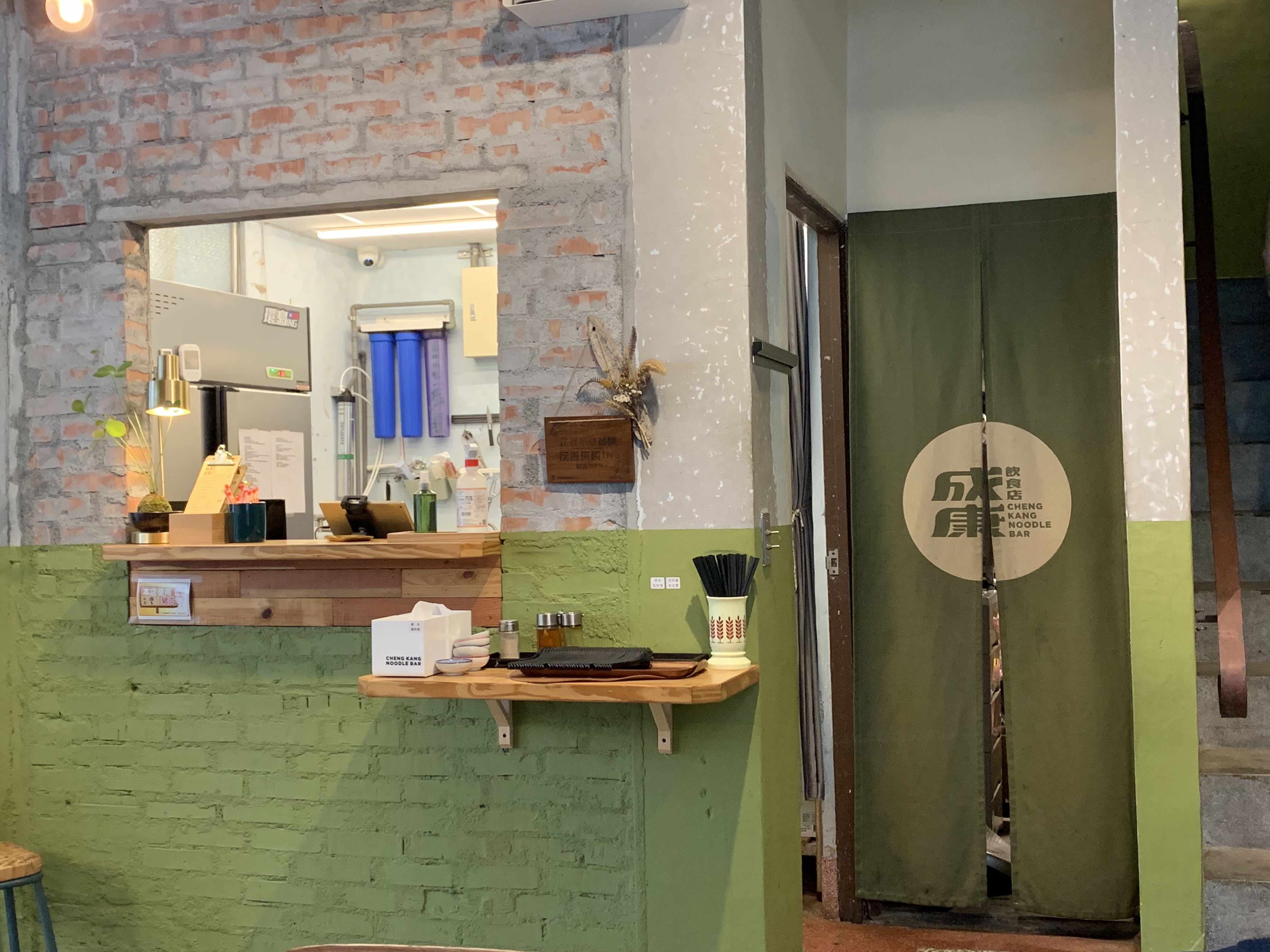
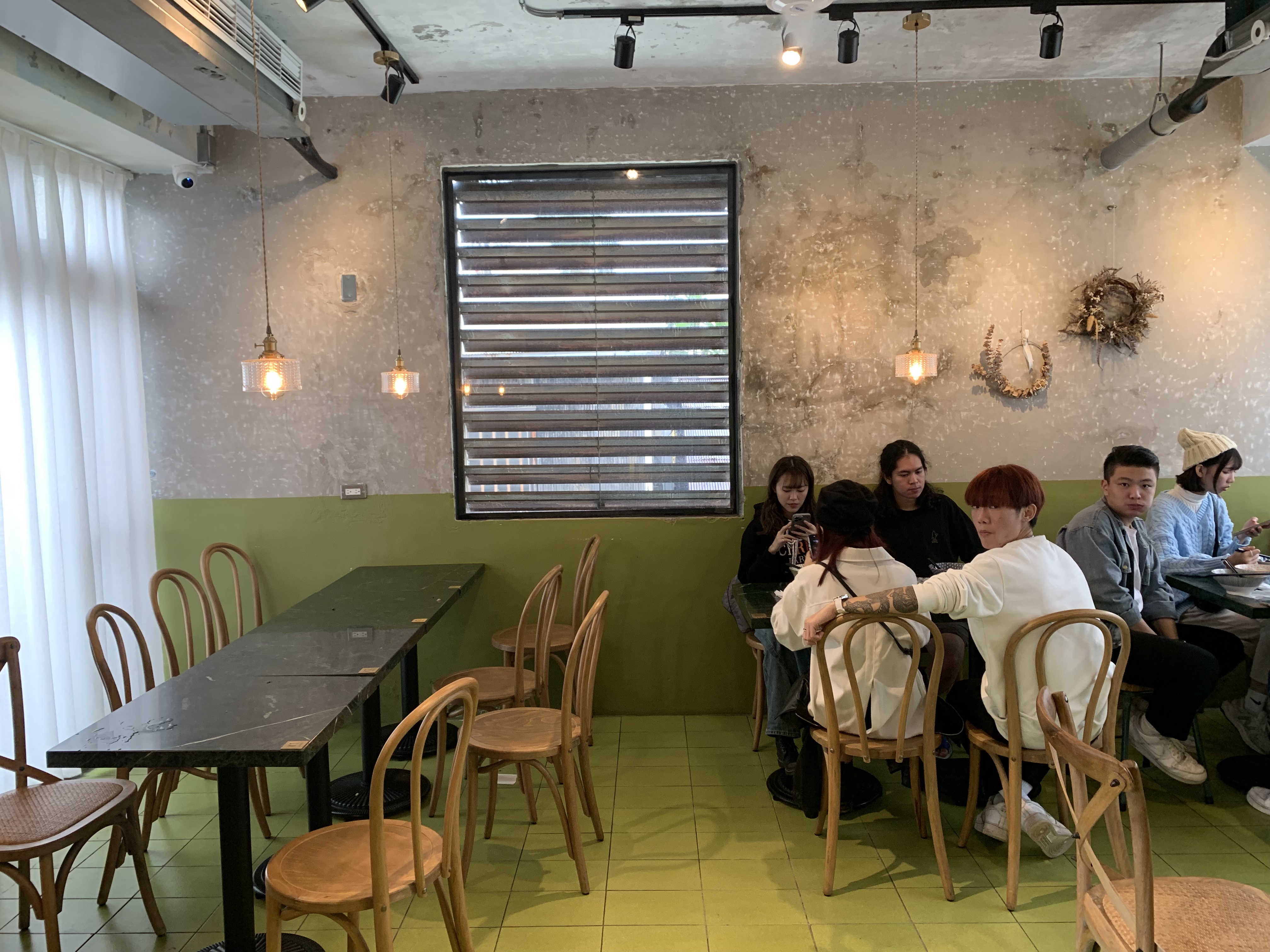
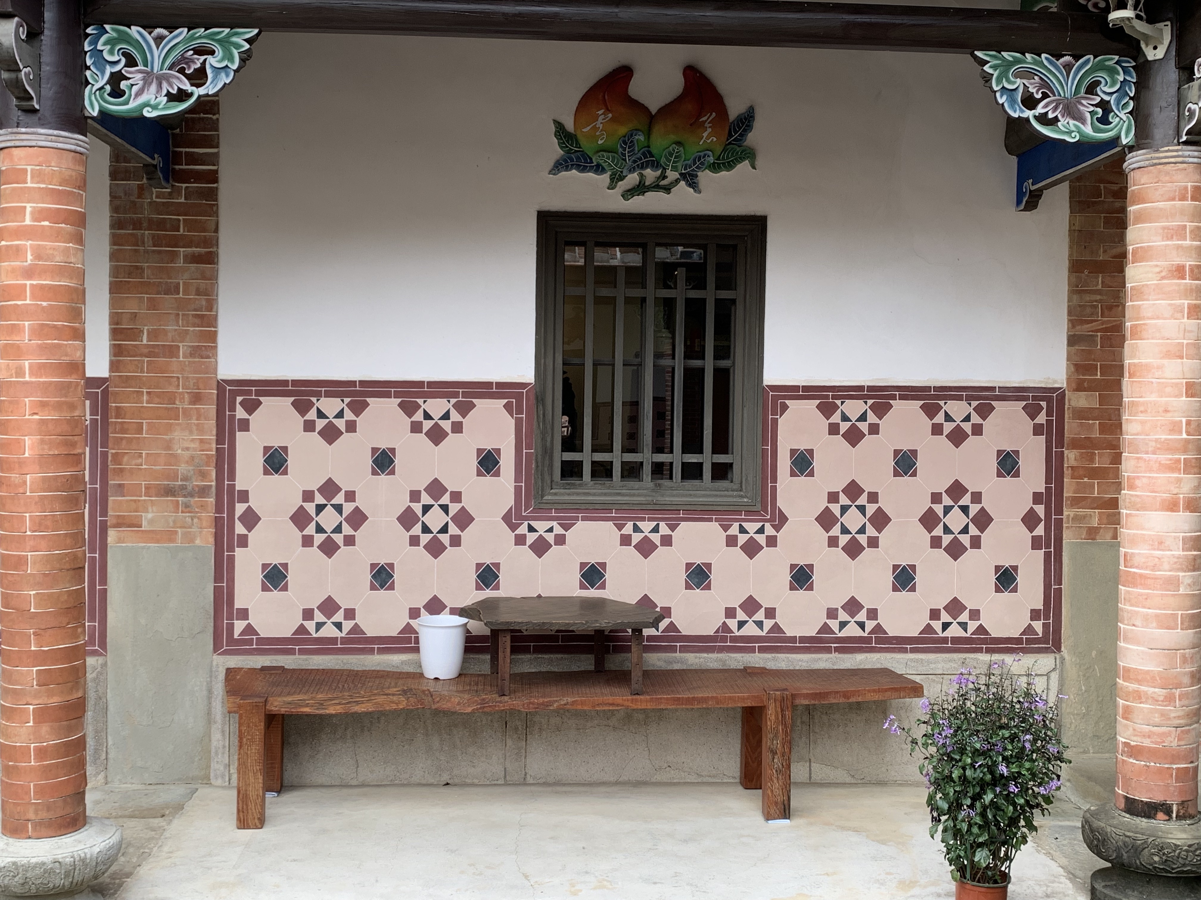
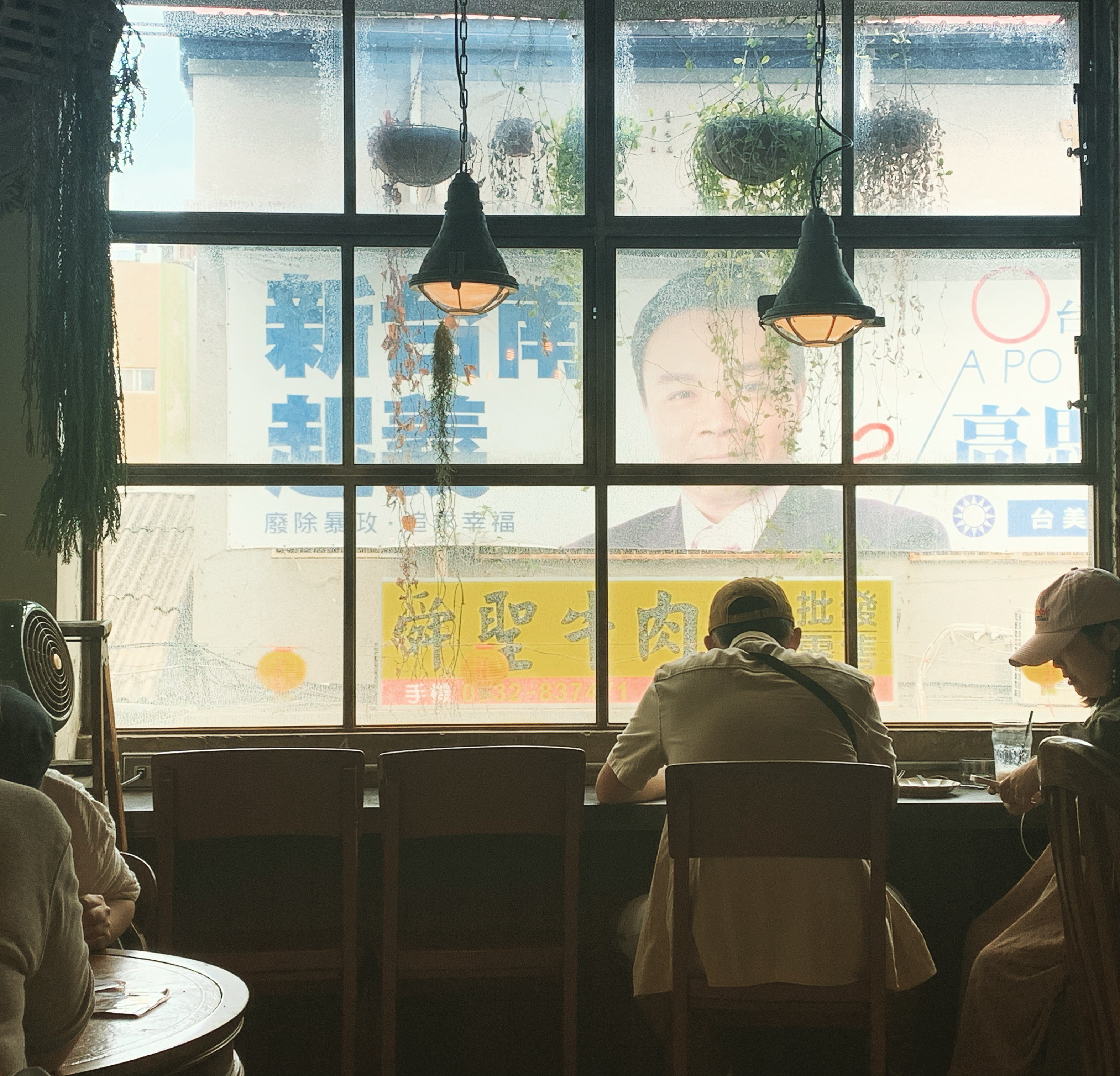
A touch of vintage wood, some plants, some funky ceramics and a concrete wall all add up to a tiny Taiwancore moment
Here's something you didn't know about me but might have been able to guess: I have many hobbies, but when I really need to de-stress by hiding in my home curled up on the couch, I binge-watch interior design Youtube.
Sometimes it's fantastic -- it's given me DIY and space arrangement ideas I would have never thought of on my own. I've learned that the "pop of red" is a bona fide Thing in design right now, and how it can look good.
Taiwancore includes plants and natural materials but can incorporate mid-century modern design (or imitations of it), smooth hard materials such as terrazzo and even faux leather
It's not all worthwhile, however. Even the more engaging creators pore over the same advice about, say, lighting plans, rug size and curtain length. A lot of it boils down to "elevating your space" by simply spending more money. Do you want furniture and floors that look good and will last? Spend more money on floors and furniture! The oeuvre does one thing right, however: I've absorbed quite a bit about different design styles and how to approach them. Take "Japandi" for example. It's a made-up word but accurately describes a warm, minimalist, organic style that finds a connection between the clean lines and pared-down aesthetic that is popular in both traditional Japanese and Scandinavian (Scandi) styles. Both rely on neutral colors and an edited look -- that is, having less stuff -- but can be cozy or incorporate a bit of funkiness, whether that's an unexpected color or, say, twisted tree branches or a big weird vase.

You know Scandi, you know Japandi, but do you know Taiwancore?
The term describes fairly well the style that many upwardly mobile Taiwanese aspire to: perhaps recently free of the clutter of their parents' homes, which may be stuffed glass-fronted wall units full of things nobody uses, boxes in the corner and plastic where plastic simply shouldn't be, so many people I know in Taiwan want light woods, warm neutrals and fewer possessions.
Take this popular sofa from the Taiwanese maker AJ2, which I happen to be lusting over. When I talk interior design with students and friends, this commercial seems to capture their dreams. I get AJ2 ads that offer "city living, beige vibes". I'm the least beige decorator I know -- my home office is electric purple and fire engine red -- and yet I want their damn sofa. Which means that their ads are good, and capitalism is inescapable.
AJ2 seems to take a lot of style cues from Muji, which is quintessentially minimalist Japanese and also popular in Taiwan. I don't want to talk much about Muji, however, due to allegations of forced labor in their supply chain.
Or consider this tour of celebrity Chen Zijian/Retina's (視網膜)'s home. It doesn't just scream Japandi -- it's straight-up Japan. Not everyone wants such a literal interpretation, but incorporating overtly Japanese elements into design is very popular in Taiwan, for both historical and contemporary reasons.

Taiwancore is fundamentally Japanese, but can include a touch of the weird or out-of-context
Japanese design also suits the Taiwanese environment, not only because there are still many old Japanese-era houses to take as reference points, but because high-quality durable natural materials do well in this climate, whereas thick rugs and particle board don't. There's a reason why maintained or restored Japanese buildings, despite being decades older, can remain lovely and even inhabitable, whereas the junk built by the newly-arrived KMT is falling apart and looks like crap no matter how much work you put into it.

Taiwancore does not require Chinese design elements, but vintage Japanese and early 20th century elements are major reference points
There's another style in Taiwan, though, that is popular across commercial spaces, from boutique hotels to twee cafes. I would like nothing more than to see it creep into residential design, and perhaps it already is.
Taken from the recent popularity of interior design buzzwords like cluttercore, Barbiecore and carnivalcore -- as well as their antecedents, such as normcore and cottagecore -- I would like to officially dub this particular style Taiwancore.But what is Taiwancore? When I posted about it on social media, not everyone shared my vision of what is and is not part of this style. It's not the same as "your grandma's house", because while I can't speak for Gen Z, the Millenians and Gen X Taiwanese I know aren't at all interested in their homes looking like Sunday at Auntie Chen's in Yunlin.
It's something a bit more than that. More modern, more pared-down, more relaxing and aesthetically pleasing.
What I'm about to say is of course just my opinion about the design elements behind Taiwancore, which is a term I made up, not a real thing in any official sense. I'm not a designer, and I don't speak for all of Taiwan (or any of it, really). I speak for me.

Perfect Taiwancore: terrazzo, wood-frame furniture, milk and textured glass, big windows, white walls, vintage lamps, plants and a shoe rack. From Sunnyday House homestay in Hualien.
Taiwancore may draw its base inspiration from Japanese design, but it doesn't stop there. I'd argue it's just a bit more cluttered, more reliant on the use of plants, and quite a bit more colorful.
I would say Tainan is both the spiritual and literal home of Taiwancore, and has the biggest concentration of it. All those creatives who decided Taipei was too dour, expensive, and full of old people with crappy opinions who moved to Tainan to do their thing have really contributed to this. That said, you can find examples of it across Taiwan. For instance, here are several fun cafes and restaurants in Miaoli -- yes, Miaoli -- that embrace the style. (The post is pre-pandemic so I can't guarantee they're all still open).
Taiwancore is more than just a way of decorating that happens to have originated in Taiwan, which can be used to describe the interiors of many popular cafes and restaurants. I'd call it a design style for two reasons: first, it's recognizable and cohesive. There are principles, and you can design according to them.
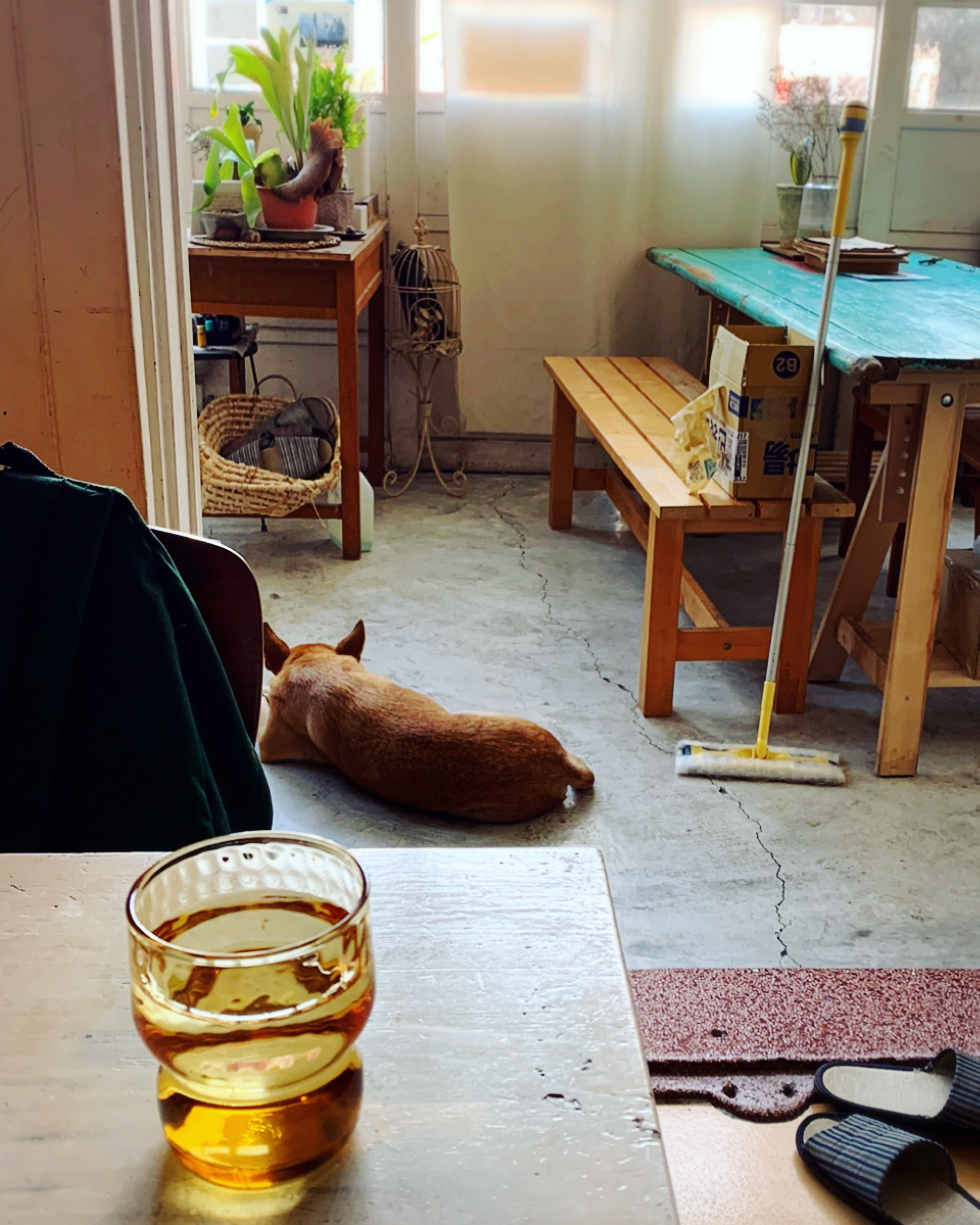
Wood, woven materials, concrete, terrazzo, vintage amber glass and a dog: classic Taiwancore, and each has its cultural place.
Secondly, it's tied to Taiwanese culture and identity. After successive waves of colonization over the centuries, from the Dutch to the Qing to Japan to the ROC, and decades of the KMT telling Taiwanese they are merely a subset of some Great Chinese Nation and do not have their own culture, a Taiwan that has discovered itself, taken note of its distinct culture evolved from multiple roots -- which include but are not limited to Chinese cultural heritage -- design elements that may not seem meaningful at first glance actually do carry some weight.
Tile and polished concrete are such common building materials that of course they'd have an impact on the style. The climate helps the whole plant-based element. That bright cyan color can be traced to its heavy use in the 1950s. Design icons, from blue and white sandals to blue, green and red shopping bags to mullet roe and milkfish, have turned into totems or even shibboleths (in that they are also items in past and current use) distinguishing Taiwan as a cultural entity.
And, of course, when one looks back on Taiwanese colonial history, and Japan -- as horrible as the Japanese empire was -- seems to have been a better deal than what the KMT pushed on Taiwan -- of course the reasons for the heavy Japanese influence become apparent. Or perhaps Japan left behind so much infrastructure that it's made its way into contemporary design style just as concrete and tile have.
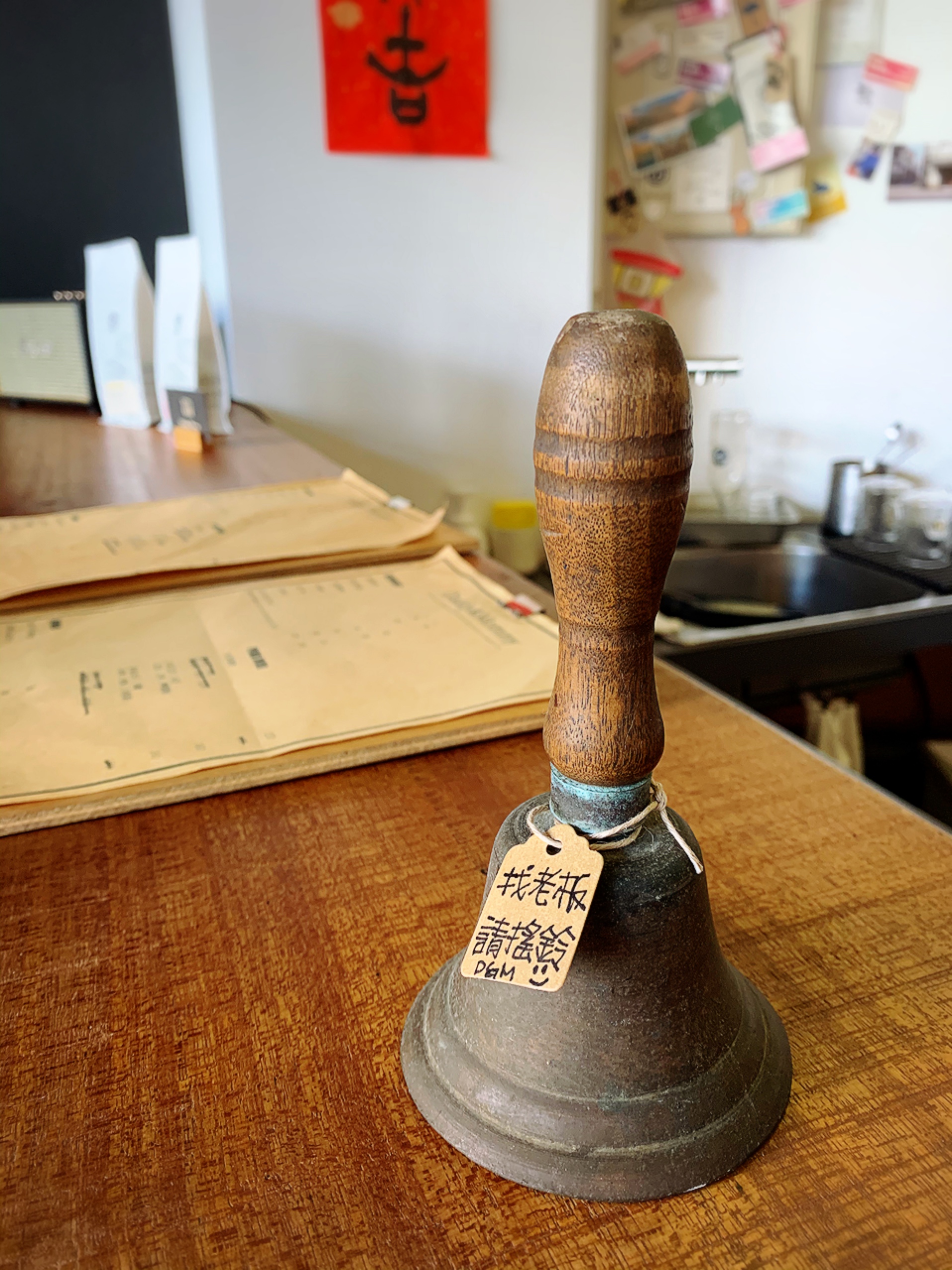
At Daddy & Mommy in Houlong, Miaoli, you ring a temple demon bell to get the boss's attention -- a more intentional connection between design and culture.
Yes, this is culture. Culture is so often too narrowly defined by just a few of its aspects, such as literature, traditional dress, cuisine and music. Those things matter, but culture is better defined as how a group of people make sense of the world in identifiably similar (though perhaps not exactly the same) ways. That includes things like how climate impacts your daily life, how you relate to your living space and objects that immediately convey a sense of 'home' or 'daily life' to those who recognize and use them. It includes how history impacts lives today.
Interior design is an outgrowth of culture -- which you can see in all sorts of styles, from Scandinavian to Japanese to Early American (which in its worst form might be called Coloniawful) to Mediterranean to, yes, British design. How houses are built is part of culture. That American houses tend to use wood frames but Asia has gone all in on concrete is part of culture. That Mediterranean style leans on blue and white but India prefers a rainbow of Dayglo colors is culture. What we put in our homes and why is culture. Intentionally repurposing and restoring old spaces after decades of tearing them down is culture. Taiwancore is culture.
The restored aesthetic at Sun Hong Ho in Tainan, complete with colored glass eight-sided window.
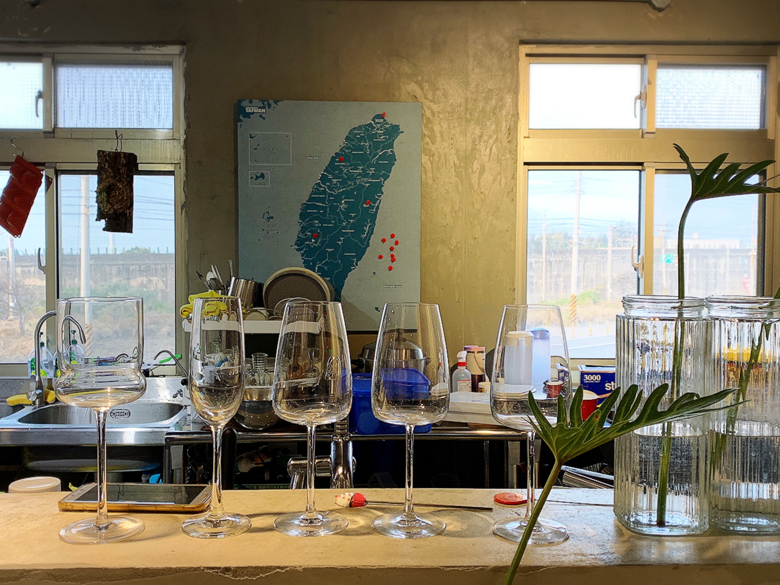
Polished concrete walls, textured glass, a pop of blue-green, plants and even a Taiwan map: not your mother's house, but excellent contemporary Taiwancore at Reinstatement in Houlong, Miaoli
It is very vintage-inspired and relies on heavy use of bamboo, wood and woven materials, which in a sense gives it elements of boho style (or, as that word has been called offensive as it comes from "bohemian" meaning Romani-inspired, "global eclectic").

This is perhaps a bit too literal (and literally old) for Taiwancore, but the reference points are there
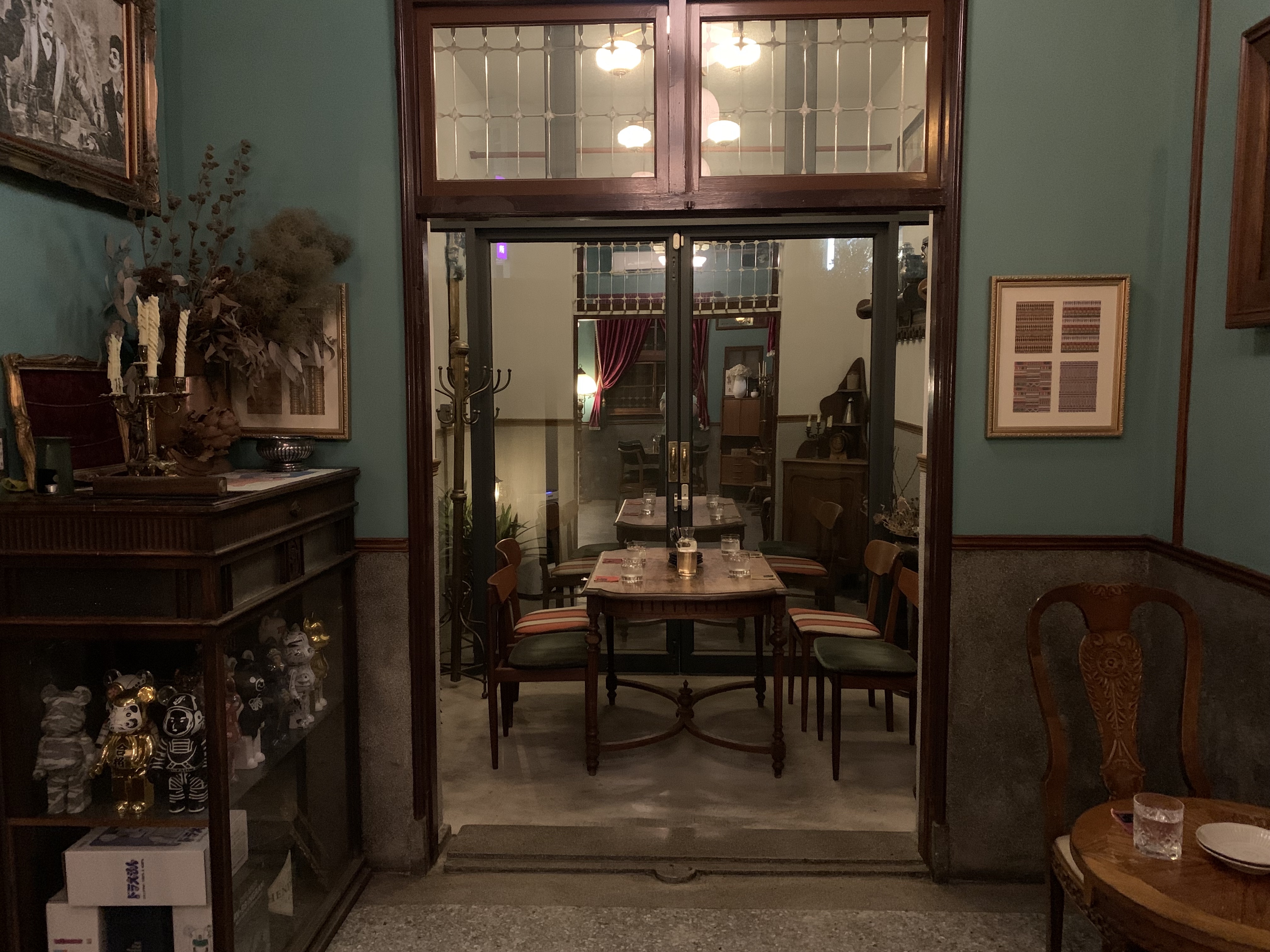
This doesn't mean grandma's deeply uncomfortable cherrywood sofa with the thin, scratchy cushions; nothing can make that look good. But it does mean wood-framed and rattan furniture, old bookcases and curated antique items. Nothing screams Taiwancore more than a vintage or vintage-inspired chair on a terrazzo floor, next to a big window looking out on a slightly wild green garden. On a side table or the windowsill, perhaps there are a few interesting books and a textured ceramic vase.
Pops of color (although colored walls are unusual), terrazzo, wood and a touch of clutter: excellent Taiwancore from Bar Home in Tainan
Other popular materials include terrazzo, preferably authentic or original to the space and polished concrete. The old-style textured glass with bougainvillea or star patterns is prized rather than thrown out (and as a result the cost of secondhand windows has gone from "almost nothing" to "surprisingly expensive").
Polished concrete, even on walls, lends an industrial element to some Taiwancore.
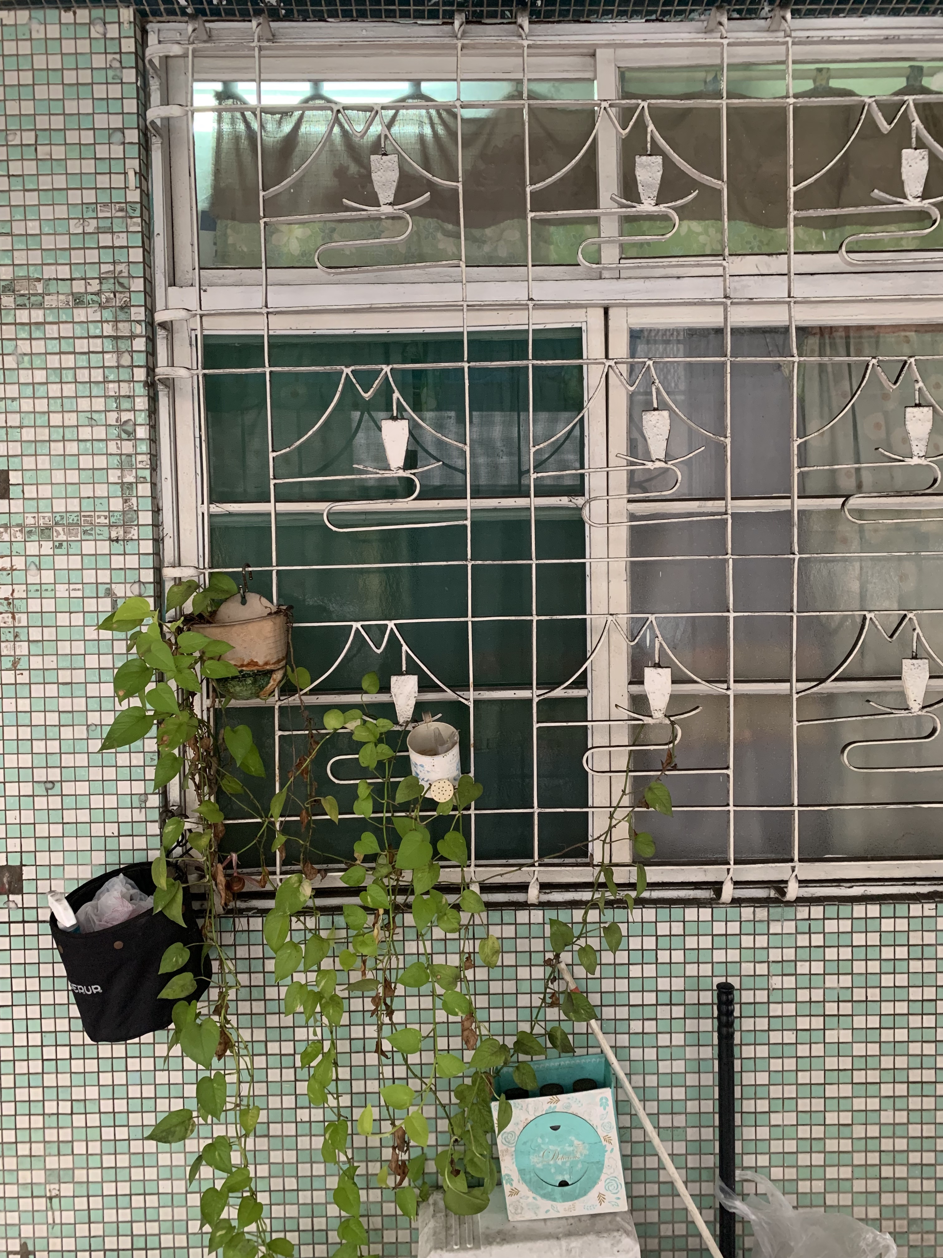
There are other vintage elements that are either key to the style, or could be. Older iron window grilles are very much a part of this style, but I haven't seen those old-style terracotta tiles coming back, but I think they should. The same goes for vintage Majolica tiles, although they sell well in the collectors' Facebook groups I'm in. Majolica-inlaid stools and side tables would work perfectly with this style. Less expensive patterned tiles, however, have seen a resurgence -- commercial spaces, at least, seem at least somewhat more interested in preserving them than tearing them out.

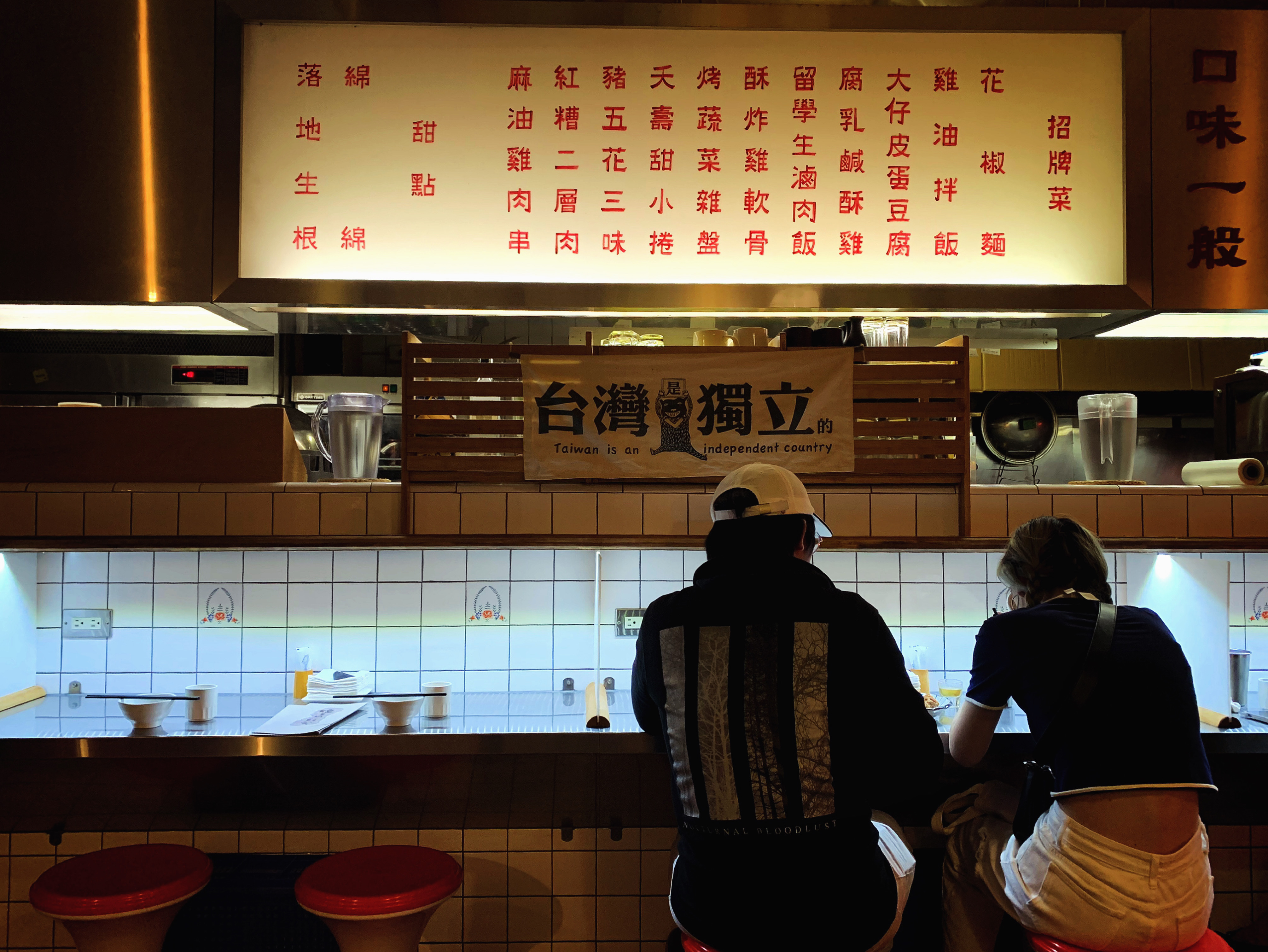
Old style tiles and a Taiwan Independence flag at Chan Shifan, a popular Taipei eatery
Neutrals are a big part of the style, especially considering the use of wood, bamboo, rattan and polished concrete. Linens and undyed canvas are right at home in this style, and can even be paired with, say, faux leather.
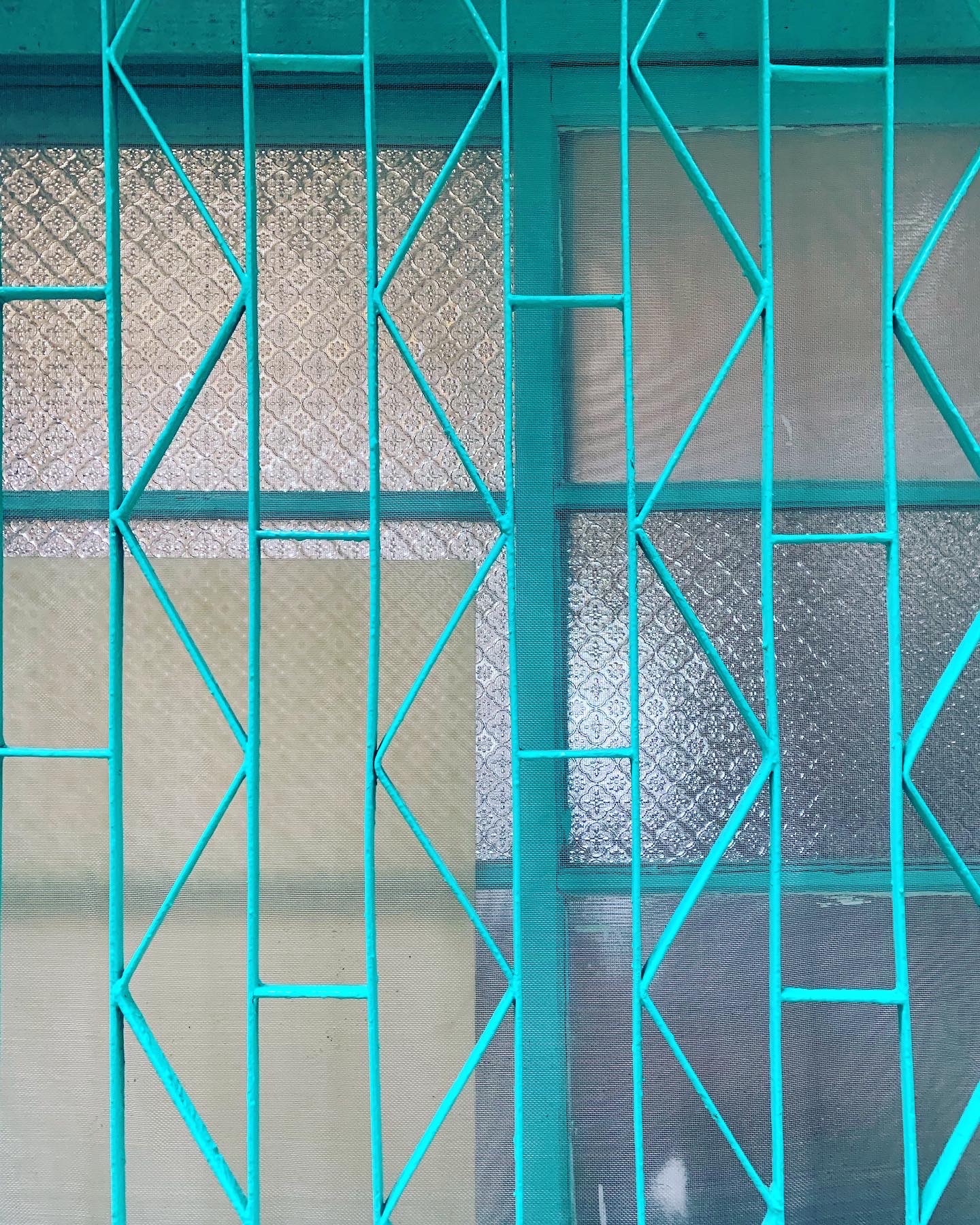
That said, Taiwancore can and does include more color than you'd expect. Taiwancore is very good at the "pop of red" and incorporation of blue and white, given the Chinese influence. Green comes in through the profusion of plants, if not in the house, then just outside it. The bright aqua or cyan color I once wrote about is a part of the style, especially when paired with red, but actually seems to be on its way out a little bit: a few years ago, every new cafe seemed to have a false wall made of reclaimed wood or windowpanes, and parts of it inevitably included the cyan color one sees everywhere, especially on old window casements. They're less popular now, but I'd love to see cyan come back in other ways -- paired with red for a more traditional look and eye-catching contrast, or in a more unexpected place, such as textiles.

Textured glass, pops of color such as red and cyan and window grilles are key elements of Taiwancore
Wood, textured glass, window grille, natural materials in the blinds, and a pop of red: Taiwancore at its finest
In fact, textiles are already a popular way to add color, from vintage '70s knits that use hot pink, green, yellow, orange and brown to contemporary patterns by Taiwan-based companies like inBlooom and Gimgoanheng. While inBlooom tends to feature traditionally Taiwanese designs with a more muted or pastel palate, Gimgoanheng dives straight into color, including a blue/green/red shopping-bag inspired pattern that I absolutely love. Those shopping bags are making a comeback, and I especially like seeing the color palate in new contexts.
The only place where color doesn't often make an appearance is on walls: whitewashed, polished cement or wood paneled walls can all be found in Taiwancore, but not so much walls painted a color. While I'd like to see that change (remember, I'm a "let's paint it electric purple" type of person), I suppose this allows brighter colors in textiles and tiles to be more of a focal point.
Plants are indispensable to Taiwancore, even if they're outside
One could say that Taiwancore is a confluence of traditional Japanese and Chinese design, and in a way it is. I'd argue, however, that you can take the Chinese influence out of Taiwancore -- lean less on, say, the reds, golds and the plants in mismatched blue and white ceramic pots -- but removing the Japanese influence is simply not possible. That Japaneseness can be paired with other things, like furniture that leans more mid-century (in fact, Mid-Century Modern chairs and tables work very well), or accessories that reference Art Deco and the Jazz Age, or a more organic-hippie look (think baskets and creamy canvas reusable shopping bags). It cannot, however, be ignored. '
Taiwancore can include elements of Chinese design, but the vintage elements and emphasis on plants are more central.

Taiwancore embraces vintage dishware, deep jewel hues and unusual or curved shapes -- it's not all Japanese neutrals and light woods
Speaking of the 1920s, I've actually seen more Art Deco elements enter the style in recent years, which might be due to the Japanese influence present in Taiwan in that era, or because Art Deco is regaining popularity now. Some of my favorite restaurants and cafes in Tainan have been leaning hard into brass curves and jewel tones, perhaps through an unexpected pop of peacock blue, or inspired by the green glaze of traditional ventilation tiles.

A pop of blue, a funky shape, ceramic -- all elements of Taiwancore even in the smallest accessories, like this soap dish.

If you want to break up the neutrals, grass, lime, bottle green or green glaze are all good choices for Taiwancore colors. Any green or blue will do, though.
Again, notice that this isn't exactly the same as simply old-school Taiwanese interiors that you might see at someone's parents' house. You know what I mean: the cherrywood, overstuffed faux leather sofas, scratchy white lace antimacassars, "bunch of stuff" on the coffee table, including some candy and a box of tissues. The heavy beige curtains with floral patterns and perhaps edged with fringe or little puffballs. The tile floors and perhaps even tile walls, even in the living room. I suppose the tiles are easier to clean, especially when the refrigerator is also in the living room.
That is perhaps another, older version of Taiwancore, and elements can be taken from it. Artfully placed blue and white plastic sandals on your (non-tile) floor. A touch of faux leather, but not quite so worn out and overstuffed, and certainly not blue. Perhaps your parents' slightly ugly side table, but without the Bunch of Stuff. Just a touch of clutter: we're not going for perfect minimalism here. Shoe rack by the door -- after all, that's functional. But the decor pieces are more likely to come from grandparents' farm than your parents' place that they decorated in 1982 and never changed.

This advertisement featuring a pun referencing buckwheat milk and boobs is both funky and fundamentally Taiwancore -- not for the pun, but for the art style
Organic shapes are also an under-appreciated element of Taiwancore. Plant shapes are present in the style, from the patterns in bougainvillea glass to the leaves and waves popular in Japanese design. Curves matter too, whether from mid-century style chairs or, for those who lean hard into old-school furniture, tree trunk tea tables, tea trays and wooden baskets.
If you're lucky enough to have a round or otherwise interestingly-shaped window, all the better. If not, embracing geometry also works: a vintage hexagon or octagon window is a nice touch, if you can get it. Stuck with squares and rectangles? I've been seeing hexagon and octagon coasters and trays, too. The hexagon is probably a global trend -- Millenials loved it. Octagons are perhaps more of a nod to eight-sided bagua (八卦) from Chinese culture.
Rattan lends itself well to this; nothing brings in curves quite like a vintage bentwood rocking chair. One of my favorite Tainan hotels has a room that features such a chair. I covet it.
All this to say, Taiwancore is unique, and its underlying design principles -- organic and plant-based elements, vintage furniture, Japanese roots and less fear of color than some design styles -- are identifiable and worth consideration. And while the decor elements one more immediately associates with Taiwanese homes, such as uncomfortable wooden furniture, plastic-topped tables, white tile floors and heavy beige curtains.
Taiwancore is your grandparents' vintage, not your parents
Unlike those outdated living spaces, Taiwancore embraces color, wood, cool and smooth materials, funky shapes and patterns, connections to the outdoors thanks to big windows and lots of plants, and a reference point that dates from long before heavy beige curtains became a thing.

A colorful antimacassar, faux leather sofa, bamboo blinds and plants at Tainan's Chung Fu Inn (also note the false wall made of white abacuses, because Taiwancore embraces funky elements)

Not modern Taiwancore, but the tiles, plants and Mt. Fuji window grille are all popular elements

Unadorned white walls and neutral woods allow the patterned vintage tiles to stand out, and note the plants visible from the windows at Cafe Kokoni in Tainan

Lime green, old brick and concrete, bentwood chairs, hanging vintage-inspired lamps at Cheng Kang Noodle Bar in Hualien

Don't forget the heaps of plants and the pops of color -- at La Belle Maison in Anping, Tainan

A bit literal for contemporary Taiwancore, but the brich, tile and funky shapes -- from the peaches to the wood elements -- are all part of the style.

Big windows, plants, terrazzo and wood at Daddy&Mommy in Houlong, Miaoli
Brick, plants, wood, ceramic and pops of color in blue, green and red
Red tiles -- I'm telling you, that pop of red -- plants, concrete and an eight-sided door at Reinstatement in Houlong, Miaoli
A big window, plants, vintage chairs and a touch of industrial chic at Follow Green in Tainan
Vintage chairs, wood, old glass, a big door, pops of red and green with a little clutter and a touch of Chinese decor at Cafe Bar in Tainan


