 |
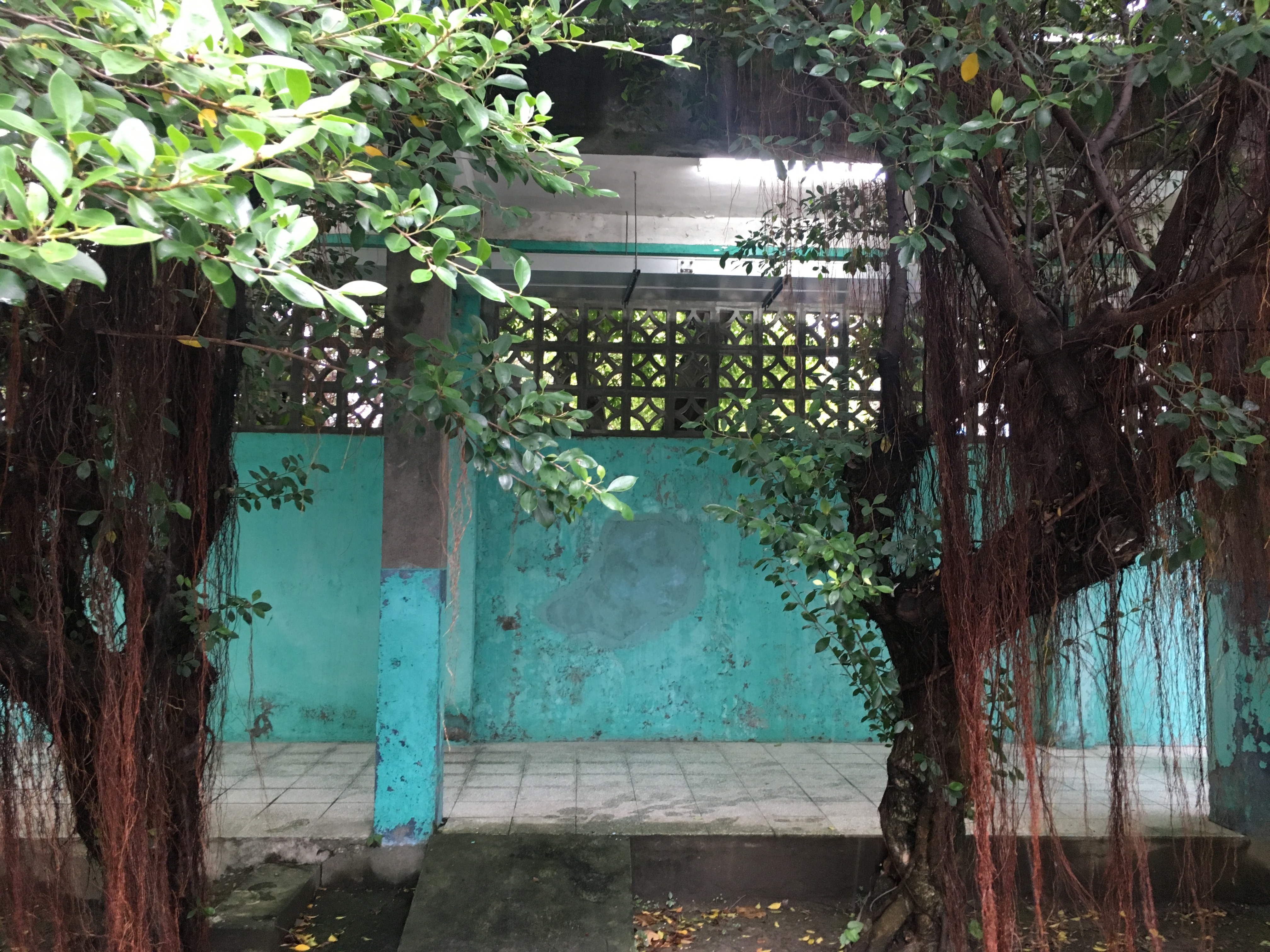
| Perimeter wall of the Jingmei Human Rights Museum |
Several months ago, I went to the Jingmei Human Rights Museum and noticed that a cyan or light teal color featured prominently on many of the buildings, especially on doors, bars and outdoor perimeter walls. I've seen this color frequently in Taiwan and if it hadn't been so predominant, I might not have even noticed it here. But it was everywhere, in a place meant to be a prison toward the end of the White Terror era.
I asked a few people who worked there, who said it was just a popular (and therefore possibly inexpensive) color at the time, and the builders perhaps wanted to bring a little bit of a 'sky' color to otherwise dank, gray, unforgiving cell blocks. I found the desire to make living quarters nicer suspicious - after all, the guards would engage in soul-crushing cruelties in other ways, so why would they care about the cells looking brighter? But that the paint was perhaps inexpensive and readily available made more sense.
 |
| I find it hard to believe that the people who built and ran this hellhole would care one bit about making the inmates feel more comfortable by painting some things bright colors. |
Another worker there told me that one name for this color, which I would call 藍綠色 lán lǜsè or 青色 qīngsè (though you have to clarify which 青 you mean, as it just denotes 'nature's color' - think new plants, a view across blue mountains, that sort of thing - and is also a way to describe rice liquor) was 防空色 fángkōng sè, or "air defense camouflage". Googling that, however, I found most things labeled 防空色 were brown, khaki or dun-colored, meant to blend into the earth from the sky. I suppose you'd really only use a bright teal or cyan as 'air defense camouflage' if the thing you were trying to obscure stuck out into the sky - but that's just conjecture.
I wanted to know more, but being both busy with graduate school and not exactly a great investigative reporter, I didn't get very far. Tatung (大同) famously made electric fans in that color - fans which have become one of the traditional products that form a sort of iconography or semiotic imagery of Taiwanese history and identity, alongside rice cookers from the same company, small Taiwan Beer glasses, those three-color plastic shopping bags and more. They still make those fans: I would know - I have one. The color is even called "classic green".
I hate calling people, so I dropped Tatung a Facebook message to ask why these fans were traditionally that green-blue color (it seems like it might be possible to email through their website but the only avenue seemed to require a lot of information about the product purchased, meaning it's probably not the best avenue for finding out what I want to know). I haven't received a response but I'll update here if they ever reply.
 |
| My own Tatung retro fan in "classic green" |
At that point I considered that these fans had been around since the mid-20th century, and that turquoisey greeny blue was quite popular in the 1950s in the US, which was the country that Taiwan was most looking toward as it cut off contact with China and was a strong ally to the United States. Maybe it was just, well, popular. Popular things tend to be easy to come by, and cheap, so that might be a simple explanation that goes a long way.
In any case, I Googled "air defense camouflage" in Chinese and came up with this fascinating article on the use of color and tile on Taiwanese buildings during the Japanese era (link in Chinese, by a professor at NTU).
It's a lot to sift through, but essentially there is no specific color called "air defense camouflage", and the term has been typically used for all of the yellowy browns, cement, dirt and khaki colors you might imagine. In fact, a quick look at this traditional Japanese color chart lists a bland dun-yellow-brown as "national defense color" (國防色 guófáng sè). That said, according to Horigome in the Chinese-language link above, "light green", "bright blue green" and "green-green", are colors described as 'air defense camouflage' by a the Kaohsiung City Museum and Kaohsiung City Culture Bureau. He then goes on to note that it's not at all clear that the purpose of such colors was actually to help camouflage buildings from aerial assault, but that such colors might simply have been considered pleasing or fashionable and might have been chosen for a number of reasons: performatively (to display how patriotic one was by using national defense colors); aesthetically (they just liked it), or because it was thought to fit in with the surrounding area or other colors.
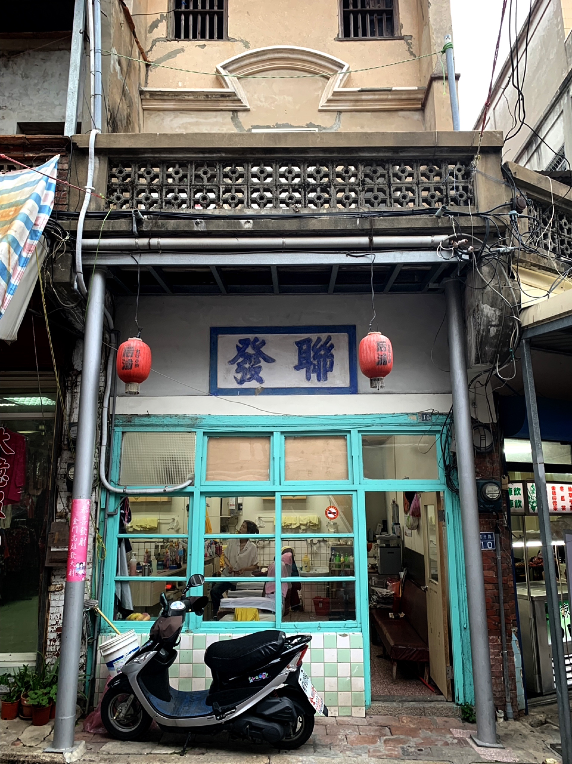 |
| A building in Kinmen, Taiwan (Kinmen was never Japanese so I doubt it would have become popular here as a result of Japanese influence) |
Looking more at that color chart again, the colors most similar to the cyans and teals seen in Taiwan seem to be either 'new bridge' or "Shinbashi" color (新橋色), clear blue-green (青綠色), fresh bamboo (青竹色), celadon (青磁色), 'ancient' green-blue (青色). Of all of these, I think 'new bridge' is the closest match, and this helpful website in Japanese explains that it was a popular color in the late Meiji era, especially among the geishas of the Shinbashi neighborhood of Tokyo.
The late Meiji is right around the time that Japan was consolidating its rule of Taiwan, so if the popularity of teal came from that...cool. Though it seems like quite a stretch to say that a color popular in Japan during the colonial era would influence, say, the color that prison bars were painted during the White Terror, or the color of electric fans in the mid-twentieth century.
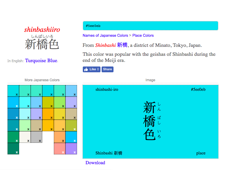 |
| The history of "Shinbashi" blue |
 |
| The color remains popular in Japan |
 |
| A Japanese-era wooden building in Chiayi city (Yeah, I went to Chiayi for a bit and never told y'all) |
My guess is that perhaps the color may have become widely used in Taiwan during the Japanese era, possibly for 'air defense' reasons or possibly simply because it was also popular in Japan. It sure does appear on the window frames and casements of a lot of Japanese-era buildings, especially brick or wood ones. Then I'd guess it simply stayed popular because it's a nice color and offers a striking and pleasing contrast with the brick and dun shades of Taiwanese buildings.
Another pet theory that I can't prove at all is that it's a popular color for window casements and bars because it is similar to sky blue - with blue window bars, you might be able to look outside on a clear day and feel like the bars (which are unsightly but considered "necessary" for safety reasons) were perhaps not there at all.
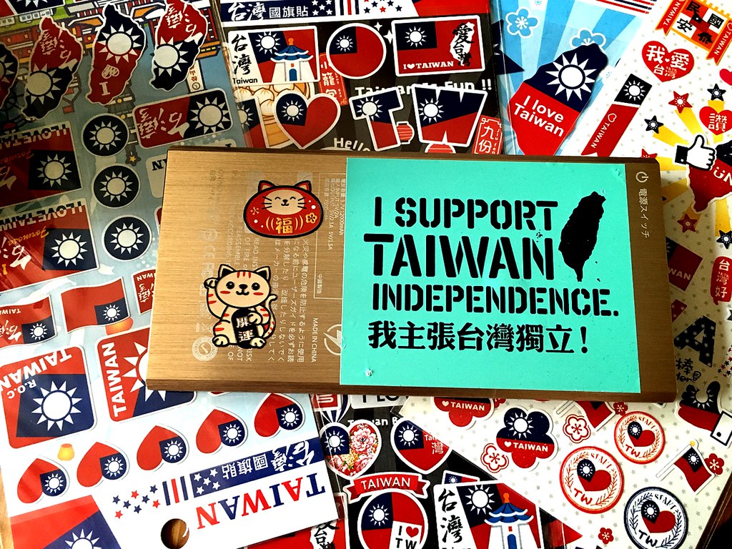
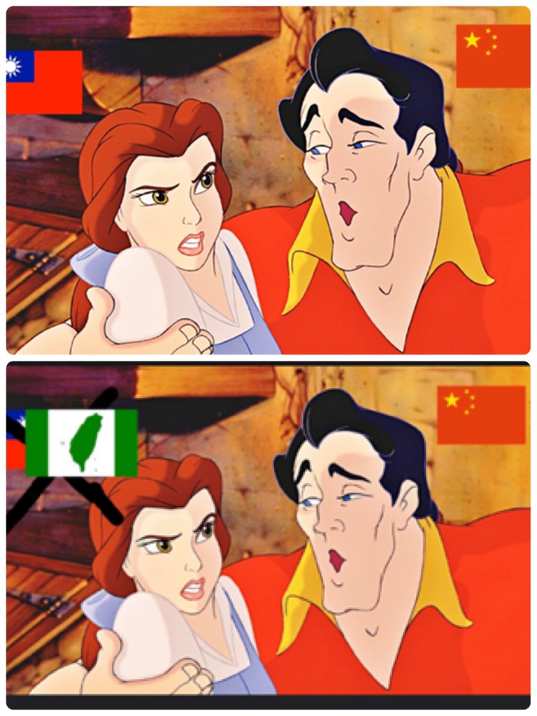
That brings us to the modern era - the color has seen a bit of a resurgence in political activism. All of those "I support Taiwanese independence" stickers, flags, towels and t-shirts use it. It's been around since at least 2014 and the Sunflower Movement, and (so I was told anyway) a well-known activist who runs a coffeeshop in Taichung designed the current popular crop of designs.
 |
| A screenshot of the designs popular today |
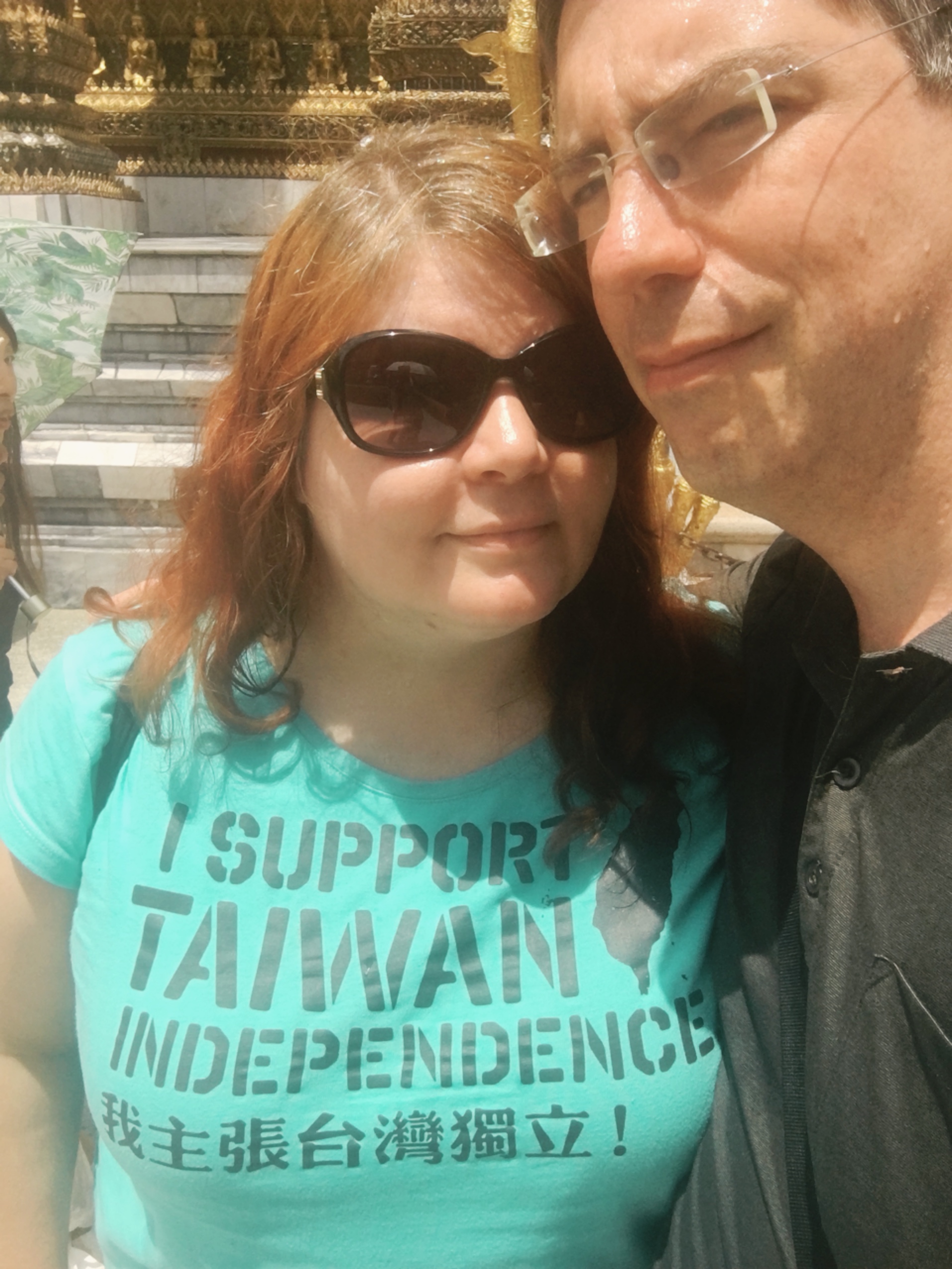 |
| Even I have the t-shirt! |
I asked around - including the person who I was told had created the designs (who wasn't too forthcoming) and didn't get any clear answers. One activist friend said he'd heard the use of the color was meant to symbolize "the mixing of green and blue, because we are all Taiwanese regardless", but expressed doubt that that was the actual intent behind the color choice. I noted the historical roots of the color, but neither of us is sure if that plays any role. Perhaps it was chosen simply because it is an attractive color that happens to be popular right now, but color symbolism in Taiwanese politics is far too complex and just inextricably intertwined with parties, ideas and movements here that I do believe it was chosen for a reason. However, I'm still unsure of what that reason is.
You might also notice that many candidates of another political party have been using that same color - the DPP. Were they using it to try and identify more closely with social movement activists? Were they trying to tap into it as a historically symbolic color of Taiwan? Why was it popping up everywhere in DPP campaigns too, as late as this last spate of elections in 2018?
 |
| See? (Lime green is popular too now) |
I asked a friend of mine who campaigned in 2018 (and won!) and who had used this color in his campaign and his answer was much more pragmatic: first, he (and perhaps other) DPP candidates felt that the party's traditional deep green was too old-fashioned - "very 1980s". The other was that since everyone was using it, it was cheaper to order campaign materials in that color.
Well, so much for trying to tie current political trends to historic notions of Taiwanese identity through color symbolism - avoiding the usual suspects of red, blue and green. Perhaps someday I'll get to the bottom of teal/cyan/"new bridge color"/"air defense camouflage", and I'll keep you updated if so.
Whether or not the color just happened to be popular in the past, there's no question that its use in political imagery is somehow intentional. It was chosen for a reason; I just don't know what that reason is. For DPP candidates, it may just be that it's inexpensive and popular but also modern, and doesn't scream "old guard DPP" while still retaining a callback to the party's traditional colors. (You'll notice that in an attempt at feminization, some female KMT candidates have been using shades of pink - this seems less popular among the DPP.)
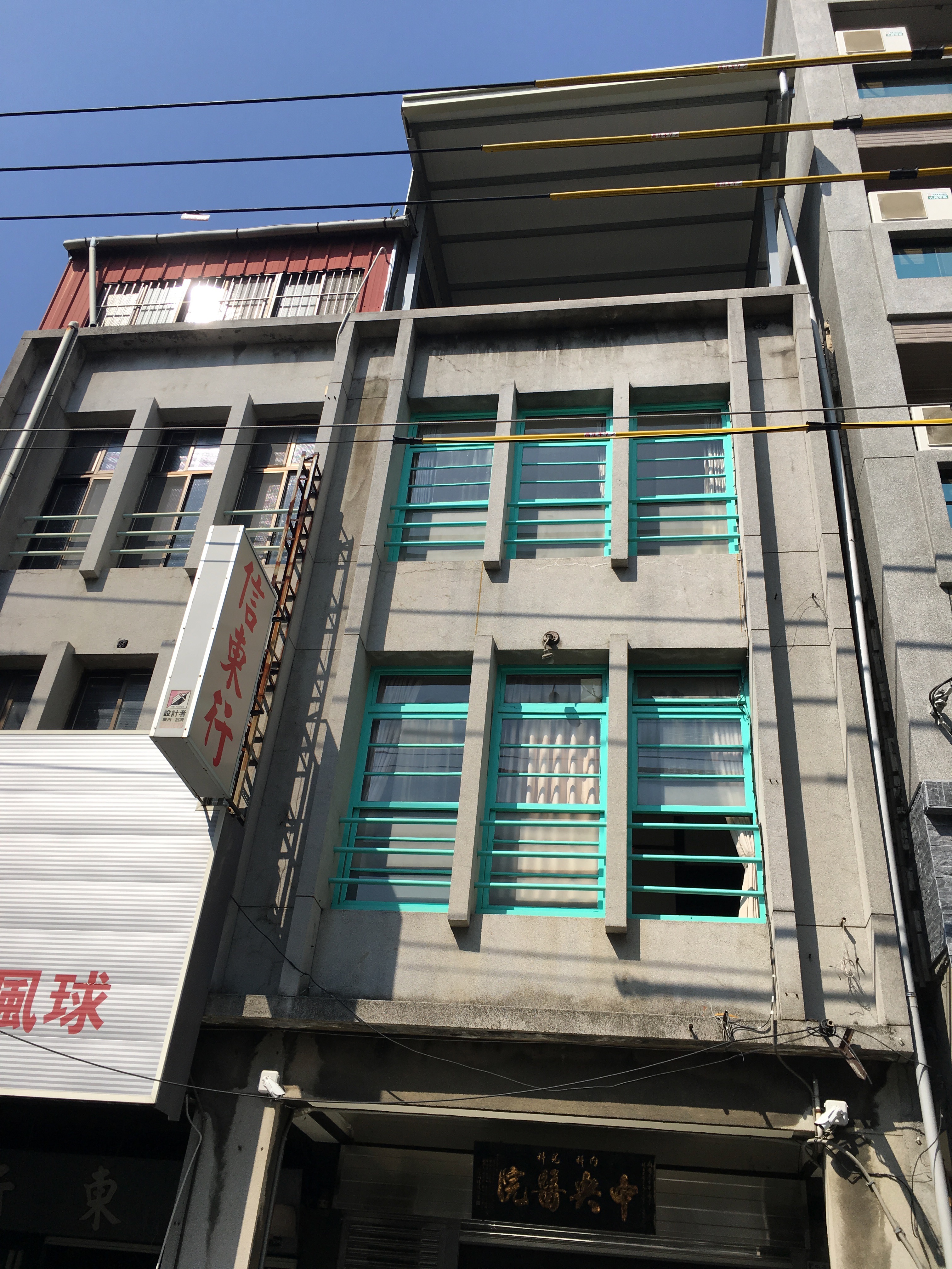 |
| Another building in Chiayi city, probably built in the 1940s (?), but that paint is pretty new. It must be a contemporary and purposeful choice. |
If you were wondering, by the way, whether my choice to use a color very similar to this on Lao Ren Cha was intentional...it was. I've associated this color with modern Taiwan and Taiwanese identity for years. It also happens to be one of my favorite colors.


